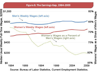
The AFL-CIO is calling for passage of the Paycheck Fairness Act to close the wage gap between men and women, a problem they say is increasingly urgent, with the above graph as Exhibit A. Get a load of that plummetting dotted gray line!
Now have a look at the right hand axis, which the perpetrators have conveniently drawn upside down for no apparent reason other than the obvious dishonest one.
This has to win some kind of prize for flagrant abuse of statistics. Do you have another candidate?
A hat tip to Patrick, who wanted to be thanked by first name only.


The “wage gap” is a serious issue, and deserves better than this flagrant attempt to mis-inform. Dreadful. I can’t come up with a worse case at the moment. Nice to see the gap is narrowing though.
Steven, to be fair to them, they were trying to re-use the same graph for absolute and relative wages, and had they draw both using the same place, they might have partially obstruct each other. This way might actually make the graph clearer.
Harold, is it not possible that the wage difference boils down to men and women having different preference? *scandal* I mean, when I go through the depts over college, I see mostly women in pharmacy and psychology, but over computer science and electronics the reverse is true. As someone from computer science, I have to lie to women and tell them I am a philosophy graduate, otherwise I wouldn’t spark any interest.
A more proper wage difference treatment would partition the statistics into jobs. Cut the data into various jobs where men and women perform similar functions, and then we have something interesting to talk about.
Ricardo Cruz: yes, the crude measure in the graph above does not tell us very much. However, I am pretty sure (no time now to look up references) that when similar (or the same) work is considered, women are paid less than men. The “preference” for women in some jobs guarantees that those jobs will be lower paid than similar jobs preferred by men.
I got a big kick out of this graph. :) Thanks.
Another good one is the UK wage gap graph that was making the rounds last week (http://yglesias.thinkprogress.org//home6/landsbur/public_html//home6/landsbur/public_html/wp-content/uploads/2010/09/didlabourfail-figure1-version1.png). That was presented no measure of mobility between income percentiles (certainly an important factor in a 40-year time horizon!) and basically ignored the relative state of individuals, instead focusing on “income percentiles” as though it is some sort of static demographic.
I can’t remember where I saw it and can’t find it on the google but I once saw a bar graph comparing food production statistics in 1950 and 2000.
Human population for 1950 was scaled to 100 and food production per capita was scaled to 120.
For 2000, the human population bar was up to 242 and food production per capita was only up to 150 or something like that.
So visually it looked like human population growth was outstripping food production and the writer tried to use this particular data set to demonstrate the Malthusian case of exponential human population growth versus linear and possible decreasing food growth.
This particular data set however demonstrates the exact opposite case because he is comparing an aggregate number with a per capita number.
What it showed was that total food production grew faster than human population.
If you multiplied the food per capita by human population in both instances to get total food production, you would see that human population grew by 142% while total food production increased by over 200%.
RC – I don’t buy your first argument. The dotted, grayed relative wage line would have stood out nicely against the red and blue solid lines of absolute wages, just as it does in the 1984 – 1989 time frame of the current graph.
Even if presentation was the primary concern, the publisher of the graph should have considered how flipping an axis would be interpreted with the topic and assertion.
Harold – You would need to look at more than just the “same work”. Other factors are important too, like “same years of experience”.
Q: How you you get a “paycheck fairness” promoter to argue that fairness already ?
A: Rephrase it!
Wrong: “Women make 80% of what men do for the same work.”
Reply: “Horrors! We must legislate this away!”
Right: “It’s possible to buy identical female labor at a 20% discount to male labor.”
Reply: “BS! If that were possible, someone would bid away the difference. If a difference that big really persists, then *I’ll* go into business employing them!”
Oops. That Q should be “already exists”.
Ryan: Your link did not work for me – I think this is the graph:
http://yglesias.thinkprogress.org/2010/09/new-labour-and-inequality/
You have to be careful what conclusions you draw from these type of graphs. There are 2 time periods, ’79-’97 and ’97 – 2008, i.e. 18 years and 11 years, the periods of conservative and labour governments. i will need to work it through a bit to see what this means. Say you as an individual move from the bottom earner at the start to the top earner at the end, but everyone else earns the same. Then one person who was the lowest of the second decile drops down into the bottom, and you push out the lowest top decile into the 80-90% portion. All deciles move up a bit, even though nearly everybody earns the same. If the earnings are uniform, say each person earns 1 more than the one below him, then the % change will be greatest for the bottom centile. Your huge increase in earnings will have had a significant re-distributive effect. In fact it looks very like the “labour” graph from aboput 25% to 80%
Now, if you were the highest earner at the start of the period and had a similar increase in earnings, you would displace no-one. Your increase will have affected only the top decile, and will have had a significant increase in the inequality. In fact, it looks very like the Conservative graph.
I think the graphs are quite effective at showing this.
The problem, if it actually is a problem, is solving itself on its own. Why do we want government intervention?
Note that single women’s wages are slightly higher than single men’s (after controlling for all the usual stuff).
And yes, the ratio axis should not be inverted.
Spectacular.
Agreed; that graph is quite a find.
As Mark Twain remarked, “People commonly use statistics like a drunk uses a lamp post: for support rather than illumination.”
One argument I have not seen on the wage gap is a certain benefit called “retirement age.” Men and women have the same retirement age, but the average U.S. life expectancy from birth is quite different — for men, it is 75.6 years, and for women it is 80.8. That’s 5.2 years that women get to enjoy their golden years that men do not have, a rather significant amount. As an example, if person A was guaranteed a $1000/month pension for 10 years, and person B was guaranteed a $1000/month pension for 15 years, we would without hesitation point out that person B has the better deal. Yet this difference isn’t even mentioned in the “fair pay” debate.
Even if you were to argue that it would be more fair to count life expectancy from retirement age, women still live 2.7 years longer. Can you imagine the protests that would happen if Social Security decided to raise the retirement age by two years, but only for women?
Relatively speaking, white women get the best retirement deal, and minority men the worst. A group interested in fairness should promote a system that took into account an individual’s life expectancy rather than just the calendar age.
Ricardo: People have studied the hypothesis that the wage gap is caused by men and women having different preferences, and come to these two conclusions:
1. Even if you factor out different preferences, there’s still a substantial wage gap.
2. But, some professions seem to have their average wages affected *because* of preferences. That is, some professions dominated by men have higher wages, and some professions dominated by women have lower wages, but this may be *because* of who’s working in them.
One of the most striking findings was this one: When people have a sex change, if they transition F-to-M their earnings go up a bit, but if they transition M-to-F their earnings drop significantly:
http://www.bepress.com/bejeap/vol8/iss1/art39/
Here’s a survey of current thinking on the topic:
http://www.time.com/time/nation/article/0,8599,1847194,00.html
Silas Barta: Do you think it impossible for a systematic prejudice to exist? And to be reflected in wages? I think you are taking the models too literally. They are a vey useful guide to the world, but they are not the world.
Silas: Your faith is touching :) However, what if *you* also see the woman in question as only being worth 80% of what the man is worth, even though you’re wrong? No, you protest, you wouldn’t make that mistake! Okay, perhaps you wouldn’t… but what if most of the population would make that mistake to a greater extent – what if they see her worth as an employee as being 75% of the worth of the comparable man? A few of you and your colleagues who see things more clearly wouldn’t be enough to erase the wage gap.
Basically, even if the point you’re trying to make were all this were about, you’d still only be right if most people accurately judged the relative value of men and women as employees or business partners. One thing the existence of a wage gap tells us is that, most likely, most people *cannot* do that correctly. You, on the other hand, assume that people can (without presenting evidence) and argue that therefore, logically, a wage gap cannot exist. Even though empirical evidence shows that it does exist.
This is straight out of a classic text on the subject:
Darrell Huff, How to Lie with Statistics (illust. I. Geis), Norton, New York, 1954, ISBN 0393310728
Most egregious use of statistics I can pull off the top of my head … Anytime during a major flux in GDP that “X as a percentage of GDP…” is used to imply that X is too high or too low or too anything.
8 or 9 months into Obama’s term I heard a friend say something to the effect of “Less than a year and he has already quadrupled the deficit!”. Sure enough he dug up a graph with CBO numbers and everything put together by Heritage showing that the deficit as a percentage of GDP had indeed rose 400% since he took office.
But of course the deficit hadn’t barely even risen a smidge at that point. What had moved was the GDP. A better headline would have been “2007 Recession continues to Shrink economy. GDP as a % of Federal Spending continues to fall.”
Framing this issue this way implies that spending was on the rise. which it really wasn’t. Sure you can make the case that federal spending should always be less than revenue, no matter what. Just like if you lose your job you can keep from going into debt by not eating.
@Harold and Cos: Then instead of pushing for laws, the people who object to this purported discrimination should take the free money by going into business themselves and hiring these undervalued women.
Problem solved, right? It’s an unlimited money source for people who don’t discriminate agianst women.
Another gap that exists between the sexes is the unemployment gap. Men are far more likely to be unemployed than men controlling for education, race and age. Of course this is explained partly in men and women choosing different career paths. Men predominately make up the blue collar sector which is more volatile the service sector where women make up large proportions.
Silas Barta: The trouble is that if you do not under value women, you must pay them the same as men. It those that discriminate that get the advantage of lower paid women.
To the people arguing over making laws, I think it’s important to know that this problem is getting better!!! That’s what this graph shows and it’s what AFL-CIO seems to be obscuring.
The problem is probably not bosses saying “Gee, she’s just a woman, let’s pay her less!” In the book SuperFreakonomics, they suggest a few partial explanations. One is that women MBA’s take fewer finance courses, for example. There’s always been a fuss about women being underrepresented in math and science. I just finished degrees in biology and mathematics and the majority of my biology professors were women. I had fewer female math professors, but the ones I did have were brilliant. I think the problem is correcting itself, but there’s bound to be some lag-time between changes in society and the work force.
Michael, excellent points about life expectancy. Permit me to add that in the U.S. it is illegal to give a 65-y-o woman a lower pension than a 65-y-o man with equal accumulations in a private pension because she has a longer expected post-retirement life span. However, it is perfectively legal and common-place to charge that woman lower life insurances rates at every point in her adult life than a man of the then same age (holding other price-affecting factors constant). Why isn’t the AFL-CIO concerned about that inequality of treatment?
Props to anyone that can explain the gender wage gap in Puerto Rico (and why aren’t women moving there from Wyoming?):
http://www.census.gov/prod/2010pubs/acsbr09-3.pdf
Harold – The reason the graph on Yglesias’ page is misleading is because income percentiles are held constant, not individuals. What I am suggesting is that a percentile divorced from the individuals who make up that percentile is misleading by definition.
The only way you could ever draw conclusions from such a graph is if every single individual remained in the same income percentile for every year studied. This is more than unlikely. It’s virtually impossible. In order to be possible, the later S-curve would have to be a monotonic transformation of the earlier S-curve.
But of course, that would completely disprove the point being made by the graph.
So I submit that whoever drew that graph knew what he/she wanted to see, and compiled the data accordingly.
Silas: Are you for real? How in any earthly way is that a “solution” to the problem? All you’re describing is a way for a canny individual to take advantage of discrimination for personal gain; are you honestly suggestion that actually solves the problem?
OK Cos, I feel it’s necessary to come into Silas’s defense.
For women, let’s say they are making 80% what a man makes for doing the exact same work. Let’s say it’s because of sexism too.
Now, I’m going to start a new industry: Super-Fly Incorporated. I need to hire some workers. I’m not sexist, so I am indifferent between a male or female worker. I can get a female workers for much less than a male worker. Why wouldn’t I hire them instead?
They might not want to work for me, though, if they’re not going to make any more money. I’ll have to offer them, say, 85% what a man makes. It’s still better off for them, because they’re making more money. But then Cos Enterprises chooses to pay them 86% what a man makes (it’s still a win-win for you and the female workers). I’ll then pay them 87% and we will go back and forth until it reaches equilibrium.
So, yes, it’s very good that people see a whole bunch of cheap labor. Women will be benefited in every way and eventually, they will make what a man makes (or about that) given that they are doing the exact same work. The data shows that the comparative wage for women has been increasing… economics at work!
@Jeremy: The reason they aren’t moving form Wyoming to Puerto Rico is because they’d be making only 2/3rds of what they’d make in Wyoming.
Wait a minute. If they had simply labeled the right axis “difference between men and women’s wages,” and subtracted each of the labels from 100% (i.e., the range would go from 50% at the top to 20% currently, we’d be delighted to see the gray line going down. I see this as a simple problem with labeling the graph, not any kind of malign intent.
Sigh. No edits. Make that 60% at the top, and insert an ), plz.
Sloppy. I should have left well enough alone. 40% at the top.
Silas and Harold:
the people who object to this purported discrimination should (…) hiring these undervalued women.
The trouble is that if you do not under value women, you must pay them the same as men. It those that discriminate that get the advantage of lower paid women.
Silas was basically suggesting to you: open up an “only women need apply” shop, and bankrupt all the sexist pigs.
Silas point is that it’s unlikely the CEO and the board of directors of some big corporation, who rarely show themselves in the floor, are forgoing the opportunity to cut costs by 20% on all their male work-force, because of some male code of honor or whatever. If you think it’s likely, stop whining and get rich while making the world a better place.
I don’t think the graph in question is misleading because they have mirrored absolute and relative wages. I think it’s misleading because they don’t try to slice the data. By lumping every kind of job out there together, they are comparing oranges to apples. It’s very likely, you know, women apply for different kinds of jobs, or that they apply for companies with fewer hours or closer to home, or for companies that provide certain benefits, etc. You don’t go through classes of statistics just so you can draw some graphs using Excel. This graph is the work of an amateur.
@Marty
I agree! Seems to be evidence that absolute income is sometimes preferred to relative income.
Ryan, I don’t think the graph is misleading, because it is not intended to show individuals income, but differences between top and bottom. It does not matter which individuals are in each centile. It is mis-interpreting it to read it that the individuals in the bottom centile have improved by the amouint shown on the graph, so I grant you that it could be misleading.
Super-Fly:
“I’m not sexist, so I am indifferent between a male or female worker. I can get a female workers for much less than a male worker. Why wouldn’t I hire them instead?”
There are a lot of assumptions baked into that that seem unrealistic. First of all, how do you know you’re not sexist? I realize this is a hypothetical, but you’re assuming the existence of an employer who can see, clearheadedly, what each employee is actually worth. Not only does this super-employer have no personal bias, but they also have magical knowledge that has eluded everyone, *and* they aren’t influenced by the rest of the world. They aren’t biased, for example, by the fact that employee A comes in with a job history of lower pay than employee B, or less responsibility – they understand that was caused by the biases of past employers, and A really can do as good a job. We can pile these on and on and on.
These employers not only don’t exist, they pretty much *cannot* exist. By idealizing away all the details of the world, you’ve come up with a mathematically logical argument devoid of context.
I think this is what Paul Krugman means when he accuses the economics profession of “valuing beauty over truth”. Your arguments are so beautiful, you’re willing to ignore the entire world in order to ignore their falsity. Sure, there is real world data that says something is true, but you have a mathematical argument for why it logically shouldn’t be true, and you’d rather believe that, and twist all the data you see from the world in order to fit your logic.
Sorry to have devolved from a rebuttal of a specific point to a condemnation of the entire economics profession :) But I see this sort of thing on so very many posts here, and in so very many newspaper pieces and articles and talks and blogs and forums where there are economists.
Harold – The fact that each S-curve in the graph is a completely different breakdown of individuals is precisely why the graph is misleading. The argument that “percentile X fared worse under party A” only makes sense if we are talking about a specific set of people.
If we’re not, then the strength of the argument evaporates — What good is it to draft policies favorable to a $25,000-$29,000/year salary band irrespective of the individuals in that band?
Whether or not we choose to acknowledge it, the argument in that graph is that one party is better for the poor and the other party is better for the rich. If yesterday’s poor are tomorrow’s rich, then nothing can be said about either party, because individuals face unfavorable policies from both parties at different times in their lives. That’s not exactly the conclusion the graph wants us to draw, is it?
Cos: The problem here is not with the assumptions, but with your failure to understand what the assumptions are. The argument does not assume that employers will know the value of their employees; it assumes only that they have a range of expectations that is unbiased by gender.
Ryan: Just had a look back here after a day or two. The graph allows certain conclusions, and hints at others. You can absolutely conclude that society became more equal under Labour than Conservative. You can also probably conclude that the individuals in the bottom did better. You can produce the Labour type graph by all the lower centile individuals “closing the gap” on their better earning fellows, or by a few individuals shooting up from the bottom to the top. In either case, at least some the individuals at the bottom are “doing better”. If yesterdays poor are tomorrows rich, you get a graph like the one under Labour.
Admittedly, it is possible to create a graph of any shape by swapping individuals. I could re-create the “labour” graph by swapping all the top centile individuals with the bottom, then pushing up the earnings at the bottom a bit. There are 2 arguments against this. 1) It is extremely unlikely. 2) It makes no difference. The losses felt by the top centile exactly match the gains by the bottom. Thus the graph continues to show us useful picture of how society has changed.
What it will not do is answer the question “is Fred Bloggs who earned $26,000 in 1997 better off in 2008?” We can use data on social mobility to have a reasonable strab at the answer to that one.
The source of the Topsy Turvy graph appears to be the “Women and the Economy 2010 Series” produce by the Joint Economic Committee of the U.S. Congress:
http://jec.senate.gov/public/index.cfm?p=2010-women-in-the-economy-series
It appears as Figure 8 in the report “Women and the Economy 2010: 25 Years of Progress But Challenges Remain” dated August 2010, which credited to “the Majority Staff of the Joint Economic Committee.”