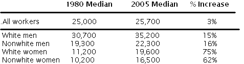
If you’re the sort of person who reads economics blogs, you’ve probably heard that the median US worker has enjoyed hardly any income gain over the past few decades. Here are the numbers behind the noise (all corrected for inflation):

A mere 3% increase over 25 years does indeed look pretty grim. And note that the year 2005 is pre-crash, so what we’re seeing is not an artifact of the recession.
Now let’s look a little deeper and ask which demographic groups account for all this stagnation. White men? Nope, their median income is up 15%. Nonwhite men? Up 16%. White women? Up 75%. Non-white women? Up 62%. That’s everybody:
What gives? How can the median income shoot up in every demographic sector while the overall median remains nearly unchanged?
Imagine a farmer with a few 100-pound goats and a bunch of 1000-pound cows. His median animal weighs 1000 pounds. A few years later, he’s acquired a whole lot more goats, all of which have grown to 200 pounds, while his cows have all grown to 2000. Now his median animal weighs 200 pounds.
A very silly person could point out to this farmer that his median animal seems to be a lot scrawnier these days. The farmer might well reply that both his goats and his cows seem to be doing just fine, at least relative to where they were.
That’s exactly what’s happened with median incomes. Each demographic group has progressed, but at the same time, there’s been a great influx of lower income groups — women and nonwhites — into the workforce. This creates the illusion that nobody’s progressing when in fact everybody’s progressing.
So let’s correct for that. Suppose the 1980 workforce had looked demographically just like today’s, with each group earning the incomes that were typical for that group in 1980. Then it turns out that the overall median income in 1980 would have been $19,600. Today’s $25,700 represents a 31% increase over that corrected figure. That 31% is for most purposes a far more meaningful number than the oft-quoted 3%.
I lifted these numbers from Edward Conard’s new book Unintended Consequences, the first chapter of which is available for free. (Hat tip to Greg Mankiw for pointing this out.)
Conard goes on to observe that things are even much better than you’d think from looking at this table because:
- The table shows only raw incomes, not the value of benefits, and benefits have grown substantially faster than incomes
- The table, because it only shows medians, does not show the explosion in income growth above the median. Fully half of the new jobs created since 1980 have been high-paying professional jobs; prior to 1980, only 23% of jobs were in that category.
One might also add that the table fails to account for the vast increases in leisure time over the past 40 years and the equally vast increases in the quality of the goods we buy. Those things matter too.


Yeh the numbers really show what you said except so what? As we both know 31% growth over 25 year sis about 1% growth per annum (.10859628) whereas the real GDP has grown 2.4% per annum (.024791764), the GINI coefficient, even adjusting for government transfers, has grown accordingly.
The average worker, however you cut it, has gotten less of the increase (I would say “been screwed”) the last 25 years and the highest earning workers have reaped most of the GDP gains. One may or may not agree that this is fair (I obviously don’t) but to try to obfuscate by playing number games is beneath you Steve.
Typo…
You stated white women’s income increased both 16% and 75%…unpossible!
You get 31% by mapping 1980’s demographics to today’s. There seems no particular reason why today’s demographic is the correct one to map to, nor why 1980’s would be correct. By careful choice of demographic, I can see how one could get any percentage increase between 15% and 75%.
Is there a sensible way to choose a “correct” demographic to map things to? Are there good arguments to show that it’s *always* sensible to correct for demographic changes at all, or when is the 3% figure actually the most relevant one?
@Mike,
The reason why you would map it like this is to determine whether there is progress for any given individual, which there appears to be.
That said, 15% over 25 years is pathetic – during that time, productivity increased by about 50%.
And the picture is considerably worse for the lowest-skilled workers who earn the minimum wage or close to it.
And it would be interesting to know how median hourly wages have developed.
By the way, there is a Wikipedia article about the phenomenon alluded to in the initial post:
http://en.wikipedia.org/wiki/Simpson%27s_paradox
Are you sure these numbers are right?
http://esoltas.blogspot.de/2012/07/inaccurate-consequences.html
Bearce: Typo fixed. Thanks for the catch.
I’m glad that Advo gave the shout out to Simpson’s Paradox, as I see this a lot in my work. When grouping people (policies, etc.) into buckets and taking measurements over time, this “mix” paradox can emerge.
One way to demonstrate would be to show results split by a) for the population that remained constant (i.e. is in both buckets, 1980 and 2005) and b) everyone else. For those in b), in this case, they may have exited the workforce and are living on retirement income, or on the flip side their previous earnings may have been ~ $0 and now they are in a low bracket, but certainly higher than $0.
The CPI attempts to adjust for changes in quality. So, if you adjust median incomes by the CPI, that adjustment in theory accounts for the ‘vast increases in the quality of the goods we buy.’
If the price of a car goes up $500 but the new car has a $500 airbag, the CPI does not change. In theory, the declining price of air travel is adjusted for the more cramped conditions and the cost of surcharges, and the declining cost of computers is even greater considering the increases in their capabilities. Of course, it can be challenging to consider the quality of an iPhone vs. a phone booth, or 1960s flight attendant service vs. 2012 flight attendant service. But they do the best they can, and as far as I know arguments are made both ways as to whether the adjustment is under- or over-stated.
Ok so splitting it into 4 groups changes things a fair bit. If we decided to split it into more groups (by age per 5 years say), we’d almost certainly get a third picture. Stratify by something else (instead of or as well) and we get 4th, 5th , 6th pictures. Presumably the “correct” picture depends on what question we’re trying to answer. When we start out with “If you’re the sort of person who reads econ blogs you’ve probably heard” it’s sort of difficult to figure out what question is being asked in the first place.
I’m wondering how you arrived at those median numbers for women in 1980. During the 1970s and 1980s, a lot of women entered the workforce compared to the 1960s and prior. If your stat for women in that year included women out of the (paid) workforce, then that by itself represents a distortion of your data; naturally a large number of women not doing any paid work or very little is going to bring the median down. A lot of women entering the paid workforce during the past three decades would bring the median up dramatically without wages paid to women who work going up very much at all. It’s the only intuitive way that I can account for the median wages of white women going up 75%.
Women entering the workforce was in fact part of what has caused wages to stagnate, along with the computer revolution and the availability of outsourcing to foreign labor. These three things moved us from a labor shortage (which had persisted for some 150 years) to a condition of labor glut except in a few specialized fields.
I add a little more here. http://bit.ly/NQHzr5
evan soltas on the possibility that conard has it backwards:
http://esoltas.blogspot.com/2012/07/inaccurate-consequences.html
Reminds me of something baseball writer Bill James wrote many years ago. He pointed out that in two years (I forget which specific years) Lou Gehrig had a higher batting average than Babe Ruth for each individual year. And yet Ruth’s average across both years was higher than Gehrig’s.
For example (and I’m making up the numbers), Ruth’s averages in the two years are .360 and .290, while Gehrig’s are .370 and .300. But their averages for both years combined are .340 and .320, respectively.
And fewer people are doing the very hard, very boring factory work that they used to do.
Regarding the Evan Soltas analysis:
Based on the census tables that he cites, here’s what I see for 2005 (in 2005 dollars):
All men: $31,725
White men: $32,179
* Soltas says $31,725, which is the median for all men.
White, not hispanic men: $35,345
Conard says $35,200 for white men, which is very close to the number for white, not hispanic. The number he uses for white women is $19,600. The Census data that Soltas cited shows $19,451.
Based on this quick comparison, I’m not sure that Soltas has discredited Conard’s analysis.
Steve, great analysis, but I have one bone to pick. The key date that great stagnationists point to is 1973. From 1947 (as far back as Census data goes) to 1973, median wages more than doubled. That was only 26 years! By comparison, the almost forty years since 1973 look very anemic. Even if you say it’s been a 30ish-percent increase.
We should be expecting median incomes to triple or quadruple over these time periods, if we believe the story about accelerating technological progress.
But unfortunately we don’t have it. So sure, life is getting better, just at a much much slower rate than it used to compared to our grandparents and greatgrandparents’ era.
Another possible demographic explanation.
previously more people got a job straight out of high school and worked till they died.
now,
more people are earning 5,000/year while going to college
then earning much more while working
then earning 15,000/year in an earlier retirement
to me the second scenario is better, but will greatly increase apparent inequality.
is this plausible? Has anyone considered it?
Re: 4 (Advo)
The data provided in the free first chapter SL links to, suggests that the 31% average increase (assuming same demographics), or even the 15% subset you note, is only part of the story. Benefits are not included in those numbers, but have increased dramatically since 1980.
And, as SL has often pointed out (and I rephrase), a $1 of inflation-adjusted buying power today is not a $1 of inflation-adjusted 1980 buying power. First, would you rather have a brand-new 1980 widget at 265% of its cost in 1980 or a brand-new 2012 widget at its 2012 cost? (You can use 236% to compare 1980 to 2005.) Second, I suggest there is the grocery store “shopping basket” issue. Since inflation does not affect all prices by the same %, it becomes a bit like comparing my purchase at grocery store X to what the same would have cost at store Y without realizing they have different items on special.
And, by the way, there has been a slight drop in average annual work hours in the US in that time period.
The problems with median family income are well known. For one thing, the statistics conflict with the consumption statistics. The median size of a newly constructed house in 2005 was almost 40% larger than one in 1973. How could that be if the median income was stagnant.
And how does a 1980s iphone compare with today’s?
Christopher Wren’s tomb in the basement of St. Paul’s Cathedral is set amid those of much lesser accomplished men who are remembered with elaborate statuary. Wren’s is covered only by a simple slab of marble, with the inscription (in Latin) ‘If you need a monument, look around.’
Look around at how people live today. Not wealthy people, but ordinary guys and gals. Almost everyone has a lot more stuff and a lot more leisure.
The Minneapolis Fed had some good work on the problems with the income statistics, back in 2008. Here’s one;
http://www.minneapolisfed.org/publications_papers/pub_display.cfm?id=4049
‘The economic progress of middle-income households over the past generation is difficult to assess. Many recent reports portray stagnation—household incomes increased little, wages increased even less and rising expenses drove families into debt. In contrast, another set of reports describe large gains—income per person almost doubled, people are healthier and living longer, and the quality, quantity and variety of goods and services being consumed are greater than ever. It seems that life for middle America is stagnating at the same time it’s getting much better.’
Another piece by Terry Fitzgerald illustrates how the compositional changes to households mislead;
http://www.minneapolisfed.org/research/pub_display.cfm?id=4021
‘Suppose there are 10 people (five men and five women) each making $34,000 per year, and together they make up six households: four married couples with household incomes of $68,000, one male- and one female-headed household, both with income of $34,000. The middle income observation for these six households is $68,000, the income of a typical married couple.
‘The next year, one of the married couples is divorced. That leaves three married households and four single-headed households—two headed by men and two headed by women. Now let’s say every person gets a 10 percent pay raise. Is everyone better off? You certainly could argue that. But because of the compositional shift, the median for these seven households plummets to $37,400 because the middle-ranked observation (with the raise) is now a single-headed household.
‘This example exaggerates the actual decline in married couples, but it demonstrates why the overall household median can be misleading. In the district, every state saw a decline in married households roughly in line with the national trend.’
@Advo The reason why you would map it like this is to determine whether there is progress for any given individual, which there appears to be”
This can’t be it. If there were no changes in the populations of each demographic, the median increase in income would be somewhere between the maximum and minimum increase in median wage for the different demographics. This phenomenon happens because the different demographics change in population. Therefore we aren’t tracking individuals here at all.
What are the statistics for these demographics :
18-25yo’s
25-35yo’s
35-50yo’s
50-65yo’s
?
Ah. So one shouldn’t pay attention to median income statistics that don’t identify the median earners. I should engrave this in some highly visible place.
Regarding inflation –
in 1972, my grandfather paid $123 for 6 cubic yards of concrete (yes, they still used yards way back then. Amazing :) delivered.
Australia’s CPI then was 19.6, today it’s 180.4, so he spent $1132 in today’s dollars. That works out as $246 per cubic metre, or $188 per cubic yard.
This seems cheap to me, but I’m not sure.
*Some* things are “cheaper” now, but not everything.
Do you really think that a
“great influx of lower income groups”
means that
“in fact everybody’s progressing.”?
Thomas,
How could it not? With low income people entering the workforce, their income goes from $0 to $X, where X is some positive number, but by definition less than the median (otherwise, they wouldn’t be considered low income). If people who all ready had a job weren’t doing better, then the median would have dropped, rather than increased.
For example, consider
2,3,3,3,4,4,5,6,7,7,8,9,10
The median is 5. If these numbers remain the same and a bunch of other low numbers enters this string of numbers, the median shifts downward:
1,1,2,2,3,3,3,3,4,4,4,5,5,6,7,7,8,9,10
The median for this string is 4, a decreased median. There is NO WAY for the median to increase if you simply add a bunch of low numbers. For the median to increase when adding a bunch of low numbers, the numbers below the median in the original string must increase. This is true because looking at the second sequence it is clear that the median remains the same (4) if the numbers greater than 5 increased.
I woke up this morning and realized my previous comment (23) didn’t quite make sense. There is no reason to think the median earner today is of a different demographic than 1980.
Or rather, NEEDS to be of a different demographic.
@MikeH,
my point was that looking at specific demographics gives you an idea what, say, a white man within the top quintile of the skill/education spectrum would earn in 1980 vs. 2005. In that sense, we are looking at how one specific individual would be doing in both time frames.
If the median wage stagnation is due to the fact that, say, a lot of part-time women in low-paying jobs joined the workforce, I don’t see what one would have to complain about.
@Patrick Sullivan
The median size of a newly constructed house in 2005 was almost 40% larger than one in 1973. How could that be if the median income was stagnant.
“Innovation”, I’d say. That is, innovation in the mortgage market. And enormous interest rates in 1980 and a tendency to get mortgages with low durations.
In 1980, you’d have a homebuyer getting a fixed-rate 10 or 15 year mortgage with 14% interest AND you required a 25% down payment.
In 2005, a homebuyer would get a 30-year Option-ARM with a 2% teaser rate, interest-only for two years. Obviously, the 2005 homebuyer could buy a lot more house for the same monthly payment. Of course, that worked only for a while….
But 2005, the peak of the bubble, is really a very poor date to pick for long-term observations of housing trends.
@Patrick:
It seems that life for middle America is stagnating at the same time it’s getting much better.’
A problem is that the amount of stuff you HAVE to have if you don’t want to be at a social/economic disadvantage has gone up a lot.
And I don’t mean “keeping up with the Joneses” by buying a huge SUV.
I mean that in 1980, you needed a telephone and some kind of TV, or you where cut off from the world. You needed a B.A. to get a good job.
Now, you need a computer with internet access and a mobile phone. If you don’t have those, your social life is going to suffer and you will be at a real professional and economic disadvantage in the long term. And if you want a good job, you now need an M.A..
You can’t just live with the 1980 goods basket and expect to do as well in your life as you would have in 1980. You’re REQUIRED to have more.
Education costs pose a particular problem. Not only do you need far more education now than in 1980 to get the same job, getting education has gotten way more expensive and the very low end of wages has dropped a lot (and things like the Pell grants have fallen behind tremendously as well).
So while in 1980 you could literally “work yourself through college” as a part-time waiter and come out debt-free, today that is virtually impossible for the vast majority of people. At minimum, you’ll be laden down with a lot of student debt.
Dr. Landsburg, have you (or anyone else) ever read Stephen Jay Gould’s phenomenal essay “The Median Isn’t the Message”?
my point was that looking at specific demographics gives you an idea what, say, a white man within the top quintile of the skill/education spectrum would earn in 1980 vs. 2005. In that sense, we are looking at how one specific individual would be doing in both time frames.
Nope, that’s not a specific individual, it’s a characterisation of a demographic. I still can’t see a good reason to zoom in on specific demographics, in fact.
When this kind of statistic is quoted, it’s normally in discussions on inequality. Is the USA a more unequal society now than in the 1980’s? A more correct statistic than the median is the Gini coefficient. I suspect that the median (of the whole population) is a rough proxy for the Gini coefficient, and one the public
understands betterthinks they understand better.Certainly, calculating the Gini coefficient for the farmer’s cows and goats would show that along with the drop in the median, there has been an increase in the “inequality” of body mass amongst his herd, as computed via the Gini coefficient.
Sorry, I said something silly. The median is clearly not a rough proxy for the Gini coefficient. However, the ratio of the median of the whole population to the mean, or to the median of the top X%, probably is.
I had always assumed that overstated inflation was the main culprit. See http://travelingatomist.blogspot.com/2011/09/inflation-schminflation.html. So this is interesting. I was familiar with Simpsons Paradox, but it’s hard to identify when it’s hitting you.
Steve, I was just enjoying your book ‘Fair Play’ – in which you say that expecting the rich to pay more tax is immoral because teachers don’t take the rich kids’ lunch so governments shouldn’t do the same with money (very quick summary of an argument I’m sure you remember making more fully) .
I tend to agree with your analysis, despite thinking that taxing the rich more might be the right thing for an overall net societal gain. So my question is, if you think taxing the rich more is immoral, do you have a better solution for taxation in society? Thanks.
In the example, the farmer has two separate populations, so it is a bit meaningless to talk of means and medians. However, the point is valid that if you did, then the answer would be as described. The contention here is that many people were not working in 1980, so had an actual income of zero. All these people were not counted in the median.
If we did look at the median for a single population of farm animals, what can we say about the overall performance of the average animal from the available data? SL used the sub-divisions of people to conclude that a 31% growth fits the data better than a 2.5% growth. However, some have pointed out that might change with different sub-divisions. If only there were independedent data which could be used – Hooray! There is! We have data on the proportion of the population that is working:
http://rwer.wordpress.com/2011/02/23/graph-of-the-week-us-employment-to-population-ratio-1948-2011/
In 1980 about 58% worked. In 2005 62% worked. (The graph here is very interesting: why the sudden drop after 2004?)
So this brings in some people in 2005 who were not included in the median statistics for 1980. If we go back to the farmer, this is like saying he had some animals that were perhaps too young to include in the statistics. If he had 100 animals, in 1980 he had 42 too small to weigh. He then lined up the remaining 58, and the middle one weighed 25 units.
In 2005, he had only 38 too small to weigh. He lined up the remaining 62, and the middle one was still 25 units.
Remember the question? How is the average animal doing in 2005 compared to 1980? This is roughly the same as asking how much each animal could grow such that the median of the 62 animals in 2005 was the same as the median of the 58 animals in 1980. In fact, the “median” in 1980 is the 71st animal, in 2005 it is the 69th animal if we include the whole population. So how much growth will make the 69th animal weigh 25 units? If we assume an equally distributed population from 0 to 50 units (among the weighed animals) giving both a measured mean and median of 25 units, then each animal grows by 7.5% to give the 69th animal a weight of 25 units.
Obviously the earnings distribution is not like this. It is much flatter at the bottom. However, if the “slope” of the distribution is about the same in the middle as with this smooth distribution, then the same increase will apply. If the slope is flatter, then the growth rate would need to be lower.
Is there any reason why this growth rate of 7.5% is not a better estimate of how the “average” person is doing in 2005 compared to 1980? Perhaps someone more statistically capable could use the actual income distribution to work out a better value.
It’s very simple to construct examples of the median income declining at the same time everyone’s real income is increasing. For instance, let’s say this was the situation in 1980 for a nation with a 100 million person workforce;
0—————–45%—-Median——————-100
$14k $20k
Now, suppose 30 years later the above population is exactly stagnant thanks to, for every new entrant to the workforce, one drops out due to death or retirement. But the old median worker now earns $25k, and the 45 percenter earns $18k.
Except that, due to 10 million workers illegally walking across the border, the work force is now 110 million. None of the new workers earn more than $14k. Now we have;
0——————-$18k (median)—$25k (55%)——–100
Median income has dropped simply because the old 45%er is the new median. Even though he has more income. The old median worker is now at the 55% point of the workforce.
How does he arrive at the $19.6k for 1980 wages with 2005 demographics? He says weighted averages, but can you do that with medians?
Using Steves’s animal example, say in 1980 we have 10 goats (40%)weighing 100lbs, and 12 cows(60%) weighing 1000lbs. The median is 1000. By 2005, we have 15 goats (57%) weighing 200lbs (growth 100%) and still 12 cows (43%) weighing 1100lbs (growth 10%). How would we establish the 1980’s median weights with 2005 demographic mix using only the data in the table? The real answer is 100lbs, but what would Soltas’s method of weighted averages give?
If you use the same method and apply 1980’s demographics to 1980’s wages (i.e. a growth rate of zero and no population changes) what do you get for the median. This may be something really simple, but I can’t figure how he gets to the figures, and whether they are meaningful.
@James Knight, I think Steve has previously advocated for consumption taxes, rather than income.
@Patrick R. Sullivan, you make an interesting point. Even if income had been stagnant (which it has not), people are still better off today than they were 30+ years ago, due to technology and productivity improvements. For example, in 1980 I had a stereo, a TV, bought a daily newspaper, and went to the movies regularly. Today, my son uses his laptop for all media. Thus, while his income is actually lower than mine was at the same age, he gets much more bang for his buck.
Just to labor the point completely, here is how i did it. I assumed he took the proportion of the earners in 2005 and multiplied by the wage in 1980. i.e. in 1980, 42% of earners earned $30.7k. In 2005 it was 37%. Therefore total take from white men in 1980 with 2005 demographic was was 0.37*30.7k. Add these for all catagories and I get 19.3k – a bit different from his 19.6k.
Trouble is, if I work out 1980 with 1980 demographics – i.e. multiply 0.42*30.7k for white men, then add them up for everyone, I get 19.9k. Somebody please explain.
#8 wonderchimp
** The CPI attempts to adjust for changes in quality. So, if you adjust median incomes by the CPI, that adjustment in theory accounts for the ‘vast increases in the quality of the goods we buy.’ **
How is that even theoretically possible?
Take cars, for example. The average new car cost about $4000 in 1970; today, about $20,000. What contribution did that numerical difference make to the CPI? (I have no idea how to answer that, BTW.)
But look at it another way. How much would it have cost in 1970 dollars to purchase a car of equivalent quality to the average new car of 2012?
Infinity dollars, because it would have been impossible. The best car made in 1970, cost be damned, would be an unsellable piece of junk compared to, say, today’s Ford Focus.
Which makes me think the whole basis of using the CPI as a method of assessing the change, or lack thereof, in family income is fundamentally flawed: the content and capability of so many things has changed so much over the last forty years that meaningful comparison using dollars is practically impossible.
Instead, use the one absolutely non-renewable resource: time. It takes the same number of median wage work weeks to purchase an average new car today as it did in 1979.
But that new car is much safer, lasts at least twice as long, gets at least twice the gas mileage, rides on tires that last three times longer, and requires practically no maintenance outside of regular oil changes.
I think I remember reading a few months back (sorry, can’t find the link) that due to all these changes, it costs, in terms of time, about 23% less to own and operate a car today than forty years ago.
Considering that cars are a non-trivial expense, and that the CPI has almost certainly wildly overstated the change in car costs, why should we put any particular faith in it?
To Steve Landsburg:
This is a tremendous insight and a great post.
It isn’t 3% for all workers, and I don’t believe Conard says that it is 3%.
It is 36%. Table P-4 has all wages at $20,013 in 1980 and $27,167 for 2005 (both in 2010 dollars).
I think the chart in Conard’s book has some typos or something. From 1980 to 2010 there’s been a 31% increase, but for the year’s listed it is 36%.
The 3% comes about when he begins holding the demographic changes constant or something.
Good luck trying to re-create his chart from scratch. Though I do agree with his underlying point being made.
At least some Democrats might be on to something relevant to this debate;
http://content.thirdway.org/publications/564/Third_Way_Report_-_Collision_Course_Why_Democrats_Must_Back_Entitlement_Reform.pdf
‘Since the 1960s, the priorities of President Johnson’s Great Society and President Kennedy’s New Frontier have been on a collision course that threatens to obliterate public investments. Ever since the dramatic expansion of entitlements that began under the Great Society, investments have occupied a decreasing share of our federal budget.
‘….The result of this dramatic expansion? Entitlements are squeezing out public investments. In 1962, spending on investments was two and a half times that of entitlements. But today, as a result of this Great Inversion, entitlement spending is three times that of investments. And this trend will only accelerate in time asthe Baby Boomers retire and their benefits grow faster than inflation and wages.’
The numbers do no reflect what has happened to income distribution within the standard income ranges of the census data. The middle class started going away in the mid 1970s, and it did so after the invention of the birth control pill in the 1960s. Family size dropped, women increased in the work force, and two income families became the norm. This progressed to the point where income in the now smaller families declined, and the amount of money spent on shoppers goods- general merchandise, apparel and furniture- dropped as a per cent of total personal income. In the 1960s and the first half of the 1970s, the amount of personal income spent on shoppers goods dropped from about 14.5 per cent to a lower level, and reached about 11 per cent in most metro areas in the 1975 period.
The logic of regional centers, is as follows: Shoppers goods sales are about 15 per cent of income, and each department store will capture 5 per cent of that. So Sears, J C Penny the main national anchors in this period, will then produce sales, which on average will be say 250 per foot of sell area. Then the mall shops will get on average 150 per cent of the average sales of each department store combined. So it helps, in this period to get that average up by adding fashion stores – Saks, Lord and Taylor, or Nordstrom, and then Dillards, in addition to having a strong regional store such as hudsons, fields, or dayton department stores.
In the end, which was by 1985, department stores sales had dropped to about 100 per foot on average and rents in small shops in malls dropped lower, which meant that higher rents of the earlier era were hard to maintain, and the quality of small shops declined. There were several tricks tried by Sears and J C Penney execs, such as opening only stores with almost 100 per cent sell area, ( it was 50 50 sell and back of house in the 1960s and early 1970s) and other things. BUT the real problem was that a third of the market was really lost when the ratio of expenditure to personal income declined by 1/3rd. Now within the trade areas of each ( anchor department store) the share of market potential captured went from 5% of shoppers goods to 2.5 per cent by the 1990s and even less by 2000.
THIS IS WHAT REALLY HAPPENED TO THE MIDDLE CLASS. THEY DIDNT GO AWAY. THEY NEVER ARRIVED.
You can fool around with all kinds of data but you cannot escape the data you derive from comparing income from census data, the BEA, for metro areas with retail sales data from the survey of retail trade for any metro area. This data, which was used by us to underwrite 60 million feet of retail space in malls, reveals that a certain per cent of the middle class went up to the 20 per cent of the households which in todays terms make more income – the broader upper class- and have a bigger share of total personal income. The rest of the people are doomed to be poor in all respects. Of course many of the people and families which moved up, in the recession saw everything change and they, of course, no longer have income and have fallen off the cliff. In the end, there will be a very big change for these people in the upper 20 per cent. Over time, the size of this group, versus all households, is headed to where it was before 1965- about 2 per cent of all households.
advo: “That said, 15% over 25 years is pathetic – during that time, productivity increased by about 50%.”
Did the productivity of the median worker increase 50%? I doubt that. The productivity of the entire workforce may have increased 50%. But the technological advances of the past 30 years no doubt helped the highly skilled workers – the minority – much more than the more numerous lower skilled workers. For example, the productivity of my wife and the surgeons she works with increased tremendously since 1980 through the development of minimally invasive surgical techniques. But the productivity of the kitchen staff at her hospital probably changed very little.
Another point about productivity: why should we expect the gains from productivity to necessarily flow to labor? Fred Smith and other stockholders provided complex computerized sorting machinery to the FedEx hub in Memphis in the 1980s and 1990s. Should the benefits of the increased productivity at that hub flow to the unskilled workers at that hub? Or to the engineers who designed and maintained the system? Or to the providers of the capital?
Steve Landsburg: “the table fails to account for the vast increases in leisure time over the past 40 years”
Do you mean that full time workers are working less than they did in the 1970s? Or that more Americans are working parttime?
I don’t have access to the paper, but Debbie Baritz reports on an NBER paper
“In the paper by Orazio Attanasio, Erik Hurst and Luigi Pistaferri called, “The Evolution of Income, Consumption, and Leisure Inequality in The US, 1980-2010,” evidence showed that the higher-educated (and yes higher-earning) Americans spend more time working but less time on leisure activities than the poorer income groups, according to The Wall Street Journal.”
SL: “That’s exactly what’s happened with median
incomes. Each demographic group has progressed, but
at the same time, there’s been a great influx of
lower income groups — women… — into the workforce…
One might also add that the table fails to account
for the vast increases in leisure time over the past
40 years”
**********************************
?
If women have been dropping the bridge club,
in order to enter the work force, we have a
massive DECREASE in leisure time.
This brings to mind something I read – can’t
recall where – the commentator pointed out that
longer work hours – commonly assumed to represent
prosperity – are not an unalloyed blessing, as
there’s a cost in the loss of leisure time.
And, some years ago, another economist examined
this supposed gain. He assumed $30/hr, standard
work week, then did some estimates of the costs of
transportation, wardrobe, child care, taxes, etc.,
and figured a woman is netting $8/hr. This sugests
irrationality on a large scale, which should be of
interest to econmists.
Good stuff. It seems to me that the age of the median worker would have increased between 1980 and 2005, which would, I think, offset the performance in your numbers somewhat.
Paul T: “If women have been dropping the bridge club,
in order to enter the work force, we have a
massive DECREASE in leisure time”
Paul, what I think has been happening – and it’s been a gradual change since the 1940s – is that women are no longer working as housewives. The work of housewives is unpaid, and thus not included in income and wage statistics. That unpaid, uncounted work has now moved into the paid sector. That would include:
day care
food preparation
housecleaning (for some households)
lawn care
As these low-skilled tasks began to be included in income statistics, median wages and median income should have declined – if all else had remained the same.
A proper comparison between decades would have included the income of housewives ($0) in deriving the median statistics.
There is another factor that I think people are missing. Income levels are like floors in a huge mall. Imagine that each person has their very own escalator in the mall. When you begin your life (unless of course you come from money), you start at the ground floor and as you go through life you generally climb up. Sometimes you get stuck at a floor for a while, sometimes something bad happens and the escalator drops you down but overall it climbs through your working life. Now the real questions are:
– Why are some people’s escalator much faster than others?
– Are too many people getting stuck at an income level and can’t move up?
– Some of your elevator’s speed is based on you and some on the economy.
– Are there floors that are unreachable for certain people?
– In aggregate, what’s the mobility of people to move up through the levels?
Liberals always want us to picture a static economy, where Person A starts at income level 1 and can never escape it. That’s probably the exception, not the rule. A “Median” income level is meaningless if the values are skewed to far in either direction.
SL: “White men? Nope, their median income is up 15%. Nonwhite men?
Up 16%. White women? Up 75%. Non-white women? Up 62%. That’s
everybody: ….
What gives? How can the median income shoot up in every demographic sector while the overall median remains nearly unchanged?
…
I lifted these numbers from Edward Conard’s new book Unintended
Consequences”
********************************
This is good. I also recommend John Paulos’ “A mathematician
reads the newspaper”, full of similar anecdotes.
I saw another example recently. Some brainiac commented
that, while low interest rates have saved mortgage and consumer
service costs $200 billion, interest income is down $400
billion. (no source given)
huh? Isn’t finance zero sum, one man’s payment is
another’s receipt?
What are people thinking, when they say things like that?