Sent by a reader:
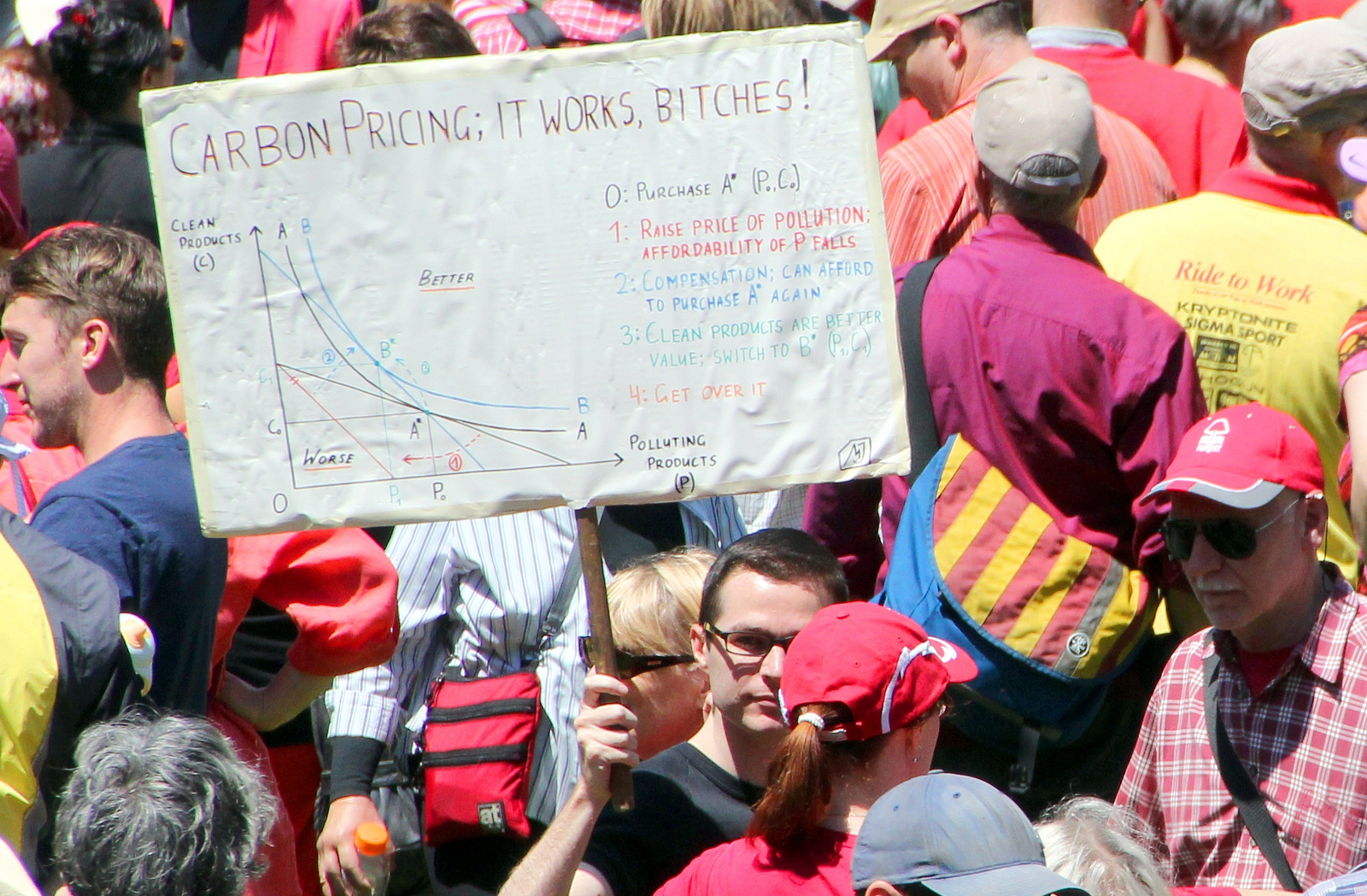
(Click to enlarge.)
Some questions for the economics students:
- Which vertical line segment illustrates the carbon tax revenue?
- Which vertical line segment illustrates the compensation paid by the government?
- Where does the difference come from?
- What difference would it make if you changed the axis labels from “Polluting Products” and “Non-Polluting Products” to “Watermelon” and “All Things That Are Not Watermelon”?
Answers below.
Answer key: On the vertical line segment descending from B*, the distance from the black line to the red line represents tax revenue (measured in units of “clean products”). The longer vertical line segment descending from B* all the way to the red line represents compensation paid by the government. The difference comes from — hrm. We don’t seem to have that information.
So what this sign proves is that if you pay $100 in carbon taxes and get back a $150 gift from the government, you might be better off. As a bonus, it also proves that if you pay $100 in watermelon taxes and get back a $150 gift from the government, you might be better off.
The moral of the placard, then, is not that carbon taxes can be good. It’s that all taxes can be good, provided we all get back more than we pay in. All it takes to make that happen is a magic genie (not pictured).


I don’t follow this part:
‘The vertical line segment descending from B* to the black line represents tax revenue (measured in units of “clean products”).’
It seems that to figure out the tax revenue, the three steps are:
– Where are you at now? B*
– If there were no tax (but holding everything else constant, including the compensation), how much more clean goods could you buy? To determine that, I would start at the point where the blue diagonal frontier-possibility line meets the y-axis, and then draw a new slanted line parallel to the first black slanted line that represented the original frontier possibility. The new slanted line is your consumption possibility frontier *with* the compensation but without the tax.
– The difference represents the tax revenue, measured in clean goods. To find that, draw a line up from B* until it meets the new slanted line.
The line that you described — ” The vertical line segment descending from B* to the black line” — would seem to me to represent the *difference* between the revenue that you paid in and the compensation that the government paid out to you. Before the government started taxing and compensating, you were on the black diagonal line; now you’re at B*, so the vertical distance between the two represents the difference.
(Of course your point still stands, that the graph is ridiculous because it argues for carbon taxes by claiming everyone can be more than they pay in. The real argument in favor of carbon taxes depends on the fact that carbon creates negative externalities; he could have made a graph arguing that point.)
But look at the punctuation! A semi colon, a comma and an exclamation mark in just 5 short words. Anyway, I find it quite encouraging since I am not too keen on watermelon.
A little learning is a dangerous thing;
Drink deep, or taste not the Pierian spring:
There shallow draughts intoxicate the brain,
And drinking largely sobers us again.
Alexander Pope – Essay on Criticism. Part ii. Line 15.
Aside from the genie being hidden in step two (I am “sure” he’d support ending the payroll tax, that “works too bitches!”), I’d like to see folks’ responses to the likelihood that for a wide range of output the indifference curve pictured ought to be much, much steeper … in that case the carbon pricing still “works” but I don’t think he’d be carrying that sign around if P1 were much closer to P0 …
Bennett: Fixed! Thanks.
I am not an economist but that sign is based on the ideas of an MIT economist John Reilly and Jake Jacoby of MIT’s Joint Program of the Science and Policy of Global Change. Basically the Genie, as I understand, is cutting income taxes proportionately putting more spending money into the hands of the consumer the stimulating growth.
http://www.npr.org/blogs/money/2013/06/28/196355493/economists-have-a-one-page-solution-to-climate-change
I don’t know why he is upset. Given his preferences, he is willing to give up “clean products” to get more “polluting products.”
Mutatis mutandis, looks like something that was copied from the blackboard after one of my 201 classes by some art history (or puppet theater) major who just wandered by. Not a clue what it means, but it sure looked impressive.
Gbalella:
Basically the Genie, as I understand, is cutting income taxes proportionately putting more spending money into the hands of the consumer the stimulating growth.
In other words, the graph (as anyone who can read it can plainly see) has absolutely nothing to do with carbon and would apply equally well to watermelon, dogfood or hybrid cars. If you think it’s a good idea to cut income taxes, I can go along with you — though I certainly wouldn’t want to rely on that graph to make my argument.
You know, I bet prisoners could use this to solve their dilemma.
Robert Frank give a much better explanation of a similar graph in his text book. The graph he’s showing should be used to promote the idea that the loss to the individual consumer can be partially (though not fully) offset by rebating that tax to a consumer. He should not be moving to a higher indifference curve than the one he started from. The justification for the tax must still come from evidence of externality.
The reason a graph like that is helpful is because some people think that if you do lower other taxes to offset the revenue from the carbon tax we’ll somehow end up at the same carbon emitting quantity, when that is almost certainly not the case.
The graph the way it is supposed to look:
http://economistsview.typepad.com/economistsview/2006/06/a_gas_tax_with_.html
12 – yes utility has to fall because even if you restore the income you’ve precluded the previously preferred mix of goods. But why does the author of your link bother referring to low income elasticity to explain why consumption of the taxed good falls? If we keep income constant (for the average person) then all we have is substitution effect. Graphically it seems there’s no way to get back to A if convex utility curves.
OK, I can see the protestor’s argument is bogus. He has been able to move to a higher indifference curve magically. He has been given stuff equivalent to the shift. So I can see Steve is right, and the need for the genie. What I don’t see is why those distances match taxes and subsidies. I’m not disputing, i am just not understanding.
Dear Steve Landsburg,
I am the protestor pictured holding the placard, and its creator. Firstly may I say I’ve always enjoyed reading your blog posts and articles, even if I do so irregularly.
In this particular case my enjoyment comes chiefly from your title – A Little Knowledge is A Dangerous Thing – which I find delightfully ironic.
You see, I drew this chart back in 2011, when Australia was in the midst of debating the introduction of carbon pricing, and a great swathe of people were struggling with the concept that it is possible to make things more expensive, provide an equal amount of compensation, yet still change consumption choices. This chart shows the stock standard microeconomic result of changed budget constraint slopes around the point of a consumption bundle. (As commenter Daniel recognises.)
Second year micro principles aren’t terrifically attention-grabbing, however, so I ripped off the title of an XKCD comic and stuck it on top.
How are you to know all this? Well, a simple web search for the title of the placard should provide as the top result (or thereabouts) the entry on my blog in which I describe exactly that background. Here it is: http://www.martincjones.com/posts/2011/6/17/carbon-pricing-it-works-bitches.html
This is the context in which the chart should be evaluated. You and your commenters are welcome to continue assessing its suitability for a different purpose to which I use it – rest assured, when I justify carbon pricing as a system I don’t invoke “magic genies” – though you’ll excuse me if I don’t engage with those discussions.
A little knowledge is a dangerous thing, I think we agree. Hopefully we all know a little more now. (I do apologise for the semi-colon, though; I’ve been meaning to fix that for years.)
Sincerely,
Martin Jones
P.S. Thanks to commenter Daniel for the link to Mark Thoma’s post. If I ever get around to redrawing this graph, and don’t have to do it from memory, Robert Frank’s graph will be useful.
The anti-watermelon loons are really just socialists that hate America.
@iceman,
Not exactly sure why he mentions the elasticity for his point, I was just using it as an example of the graph drawn correctly.
I did think of one possible way that the above graph could work. The government could rebate the expected surplus to the government from what they would have spent on carbon emmission damage.
Martin Jones: I’m very glad to see you here. But I continue to be baffled over what your placard is supposed to illustrate. Yes, it is true that if you tax a good and then offer a Marshallian compensation, you will always make the consumer better off. But it is equally true that if you tax a good and offer a Marshallian compensation, the compensation will always cost you more than you’ve collected in tax revenue. Moreover (as I’m sure you know) this combination of policies does less good for the consumer than an equally expensive pure transfer.
So what your graph actually shows is that carbon taxes are a bad idea compared to a straight transfer. Of course, you’ve obscured this fact by choosing to highlight the points you’ve highlighted without highlighting the point the consumer could reach if you offered him that equally expensive transfer. Nevertheless, that really is the true message of your graph. And this, I suspect, is not the message you intended to send.
Now it does not follow from this that a carbon tax is a bad idea, because there’s an important aspect of the carbon market that your graph fails to capture — namely, carbon can be a source of important externalities. But since the case for carbon taxation is based on those externalities, and since the externalities don’t appear in your graph, it’s really quite impossible for your graph to make a coherent case for carbon taxation.
Again: Your graph proves only two things. First, it proves that if I give people bunches of money, they’ll be happier. I think everyone already knows this. Second, it proves that a tax-and-transfer program is inferior to a poor transfer that’s equally expensive on net. That’s an argument against carbon taxes, not an argument for them. Which of those two points were you trying to emphasize?
Sigh. The diagram is correct. The blue line is the production possibilities curve in the economy with slope equal to the social marginal cost of the polluting good. The black line is the equilibrium private budget line with slope equal to the private marginal cost of the polluting good. The externality makes the polluting good appear cheaper than it really is. The red line is the private budget line with a pigouvian tax on the polluting good without return of the tax revenue. Redistributing the tax revenue as a lump sum tax gives you back the blue line. Utility is higher.
Steve Landsburg:
> I continue to be baffled over what your placard is supposed to illustrate.
That changing the relative prices of two (classes of) goods while keeping purchasing power constant (black constraint to blue constraint; “constant purchasing power” = A*) will cause a shift in consumption (A* to B*). It says so on the back: “Changing relative prices will shift consumption so long as any compensation is not delivered at the point of purchase.” (You did read that on my blog post, didn’t you?)
> [Criticisms of the chart that are beyond its scope, including that it doesn’t capture externalities or make a coherent case of carbon taxation.]
Yes. Those points are irrelevant. I made other graphs for that. (And wrote newspaper articles, and gave radio interviews, and presentations.) You’re over-thinking it.
> Nevertheless, X really is the true message of your graph.
No. Perhaps you’re being led astray by the title, which leads you want the graph to explain all of carbon pricing? All the graph does is explain that the tax-and-compensate principle is sound, reinforced by the text on the other side of the placard. Well, and bait carbon pricing opponents a bit, I suppose. (That part has been wildly successful.)
You could argue I should have titled the graph “Changing relative prices with Marshallian transfers works, etc”, but, really…
Neil:
Redistributing the tax revenue as a lump sum tax gives you back the blue line.
1) This is not correct.
2) If it *were* correct, we could increase people’s happiness any time we wanted to by taxing random goods and returning the revenue. The fact that we don’t do that should have been a clue that you were making a mistake someplace.
Martin Jones:
I’ll be glad if you can clarify a few points:
a) Do you agree that according to your graph (after you add the relevant additional indifference curve), a policy of “tax and then return the revenue as a lump sum” leads to lower utility than a policy of doing nothing?
b) Do you agree that your graph applies equally well to, say, shoes and watermelon as to “polluting goods” and “non-polluting goods”?
c) Based on your graph, do you think it would be a good idea to tax watermelon and return the revenue as a lump sum?
d) Your graph shows that I can increase people’s utility as long as I send them back more money than I take from them. Of course that money must come from someone else. Do you agree that I can always increase people’s utility by sending them money that came from someone else? Do you think that that, by itself, is ever a good argument for sending people money?
@landsburg,
Do you agree that the government will have less to spend in the future because of the negative externalities avoided by lowering consumption, and that at least in theory this could be rebated to consumers in anticipation of lower future spending (or to reduce the deficit so that future taxes will be lower whichever you prefer)?
Double Sigh. You are not taxing a random good, you are taxing a good with a cost externality. That is why the black line (showing the private MC) is flatter than the blue line (the PPC showing the social MC).
If there is no externality, the black line has the same slope as the blue line. Now taxing the good on the horizontal axis reduces utility even when the revenue is redistributed back to the consumer as a lump-sum, showing the deadweight loss of a tax in an efficient market.
Steve Landsburg: “I continue to be baffled over what [Martin Jones’s]placard is supposed to illustrate.”
I however am not the least baffled. It’s right there at the top: “It works, Bitches!” The actual diagram does not much matter. First it will be seen only in glances, moving. It is an alleged imprimatur not an argument.
Second, it was not chosen with great care, as Martin’s own remarks here show. It looked like it would serve as an emblem and so he chose it.
So what the placard is to illustrate is perfectly clear: that Martin Jones and his cohorts are wiser, more responsible, more scientific, more serious, and more admirable than are we bitches.
Neil:
Double Sigh. You are not taxing a random good, you are taxing a good with a cost externality.
There is no externality depicted in the diagram.
If the blue line were a social PPC and the black line a private PPC, then the black line would not be able to pass outside the blue line.
Here is the picture with the key missing line added:
Taxation of polluting products, together with a lump sum rebate, brings you to the green point, which was omitted from the original placard. The blue point, taken from the placard is irrelevant to the policy question.
Steve,
You have to mark the equilibrium point on the red line. The vertical distance from that point to the blue line is the tax revenue. Giving it back lump sum gives you the blue line. If, instead, you start with an undistorted economy, you will see that you get a deadweight loss–this was a famous paper by Milton Friedman which can be found in his “provisional” price theory text.
The economy cannot achieve a point on the black line outside the blue line, that is why it represents an *equilibrium* private budget line and why point A has to be on the blue line. If you put a tax on an undistorted (no externality) good as Friedman did, the private sector budget line also goes outside the PPC. That is not a problem. Whenever prices mispresent cost information it appears to the private sector that it can get outside the PPC, but of course it can’t. The equilibrium has to be on the PPC.
Neil:
You have to mark the equilibrium point on the red line. The vertical distance from that point to the blue line is the tax revenue.
Thanks. I appreciate your putting the mistake right up front where I don’t have to hunt for it. :)
The placard assumes that compensation is paid. Therefore the consumer chooses a point on the blue line, not the red line. The tangency with the red line is the hypothetical point the consumer would have chosen in the absence of compensation, but has nothing to do with what actually happens.
What matters is the new equilibrium point B*. It’s the distance from here down to the red line that shows the compensation actually paid.
There is no mistake. The utility maximizing point on the red line is *before* the excise tax revenue is returned to the economy. (It would be an equilibrium if the money were just wasted.) You use that to determine the revenue collected by the excise tax (the vertical distance from that point to the blue line.) When you return the revenue lump-sum, the private budget constraint is now congruent with the PPC.
I do wish that whenever I paid $x in taxes, I got $x*(1+y) back as a rebate. That would be awesome!
please do not forget that the externalities might be just as well positive (higher agricultural yields, little bit of beneficial warming).
Neil:
The utility maximizing point on the red line is *before* the excise tax revenue is returned to the economy. (It would be an equilibrium if the money were just wasted.) You use that to determine the revenue collected by the excise tax (the vertical distance from that point to the blue line.)
Think about what you’re saying. The government tells me it’s going to tax watermelons at $1 apiece. I say “Okay, then I’ll eat 3 watermelons” (here’s where I’ve picked a point on the red line). The govt says “Okay, then we’ll tax you $3. Oh, and by the way, we’re making a lump sum transfer to you of $3”. I reply: “Oh. In that case, I want some other number of watermelons”. Now my tax bill is no longer $3. What I’m taxed on is my actual watermelon consumption, not the hypothetical consumption that I planned to undertake before I learned about the lump sum transfer.
Neil:
Note too that what you are saying is quite inconsistent with what the placard is saying. According to you, you end up at a point directly above the red-line optimum. According to the placard, you end up on the blue-line optimum. But there is no reason to believe the blue-line optimum is directly above the red-line optimum.
Steve,
I make no statement about watermelons. The good has to have a cost externality. The before-tax budget line for watermelons is the blue line. You have to have a marginal external cost to explain why the black line is flatter than the blue line. The black line is flatter because the market does not price out the external cost.
On further reflection, my measurement of the tax revenue was wrong, but I stand by my claim that the analysis is correct. The tax revenue before being redistributed as a lump-sum is the vertical distance from the red line to the black line. The vertical distance to the blue line is the free resources (measured in units of the numeraire good) available to the economy.
As the tax revenue is redistributed lump-sum (think of it as happening incrementally) people spend it on the taxed good (generating more tax revenue) or on the income good. In any case, the red and black budget lines continue to shift up until the red line is congruent with the blue line. The market equilibrium is where the indifference curve tangency point is on the blue line (which is also the new red line), and the equilibrium tax revenue is the vertical distance to the black line (which is now above the blue line.)
The difficulty in all of this is trying to tell an equilibrium story with this diagram. That is why I use supply and demand triangles.
Neil: I applaud your heroic attempt to reinterpret the meanings of the lines in some way that will cause the diagram to make sense. But we have it from the creator’s own mouth (in an earlier comment in this discussion) that nothing in the graph is intended to reflect externalities. So the black line (as we agree) is the private budget constraint, and the red line (as we agree) is the private budget constraint with a tax but no transfer. The question is what the blue line means. You want to interpret it as a social budget constraint that reflects pollution externalities. Martin tells us that’s not the intent at all. He means it to be the private budget constraint after taxes and transfers — nothing more nor less. But in that case (not accounting for externalities) the right line to look at is not the blue line, but the green line that I drew in the diagram several comments up in this discussion. And then what the diagram clearly shows is that the tax-plus-transfer makes the consumer worse off, not better off.
You are saying that if the lines represented something other than what the artist has told us their meant to represent, the diagram as presented might make sense. This is true, in the same sense that if you interpret “Barack Obama” to mean “Bugs Bunny” and “Muslim” to mean “cartoon character”, then it’s true that Barack Obama is a Muslim. But it seems to me like you’re doing an awful lot of work to tell Martin’s story for him, and it’s clearly not the story he set out to tell. That story is, plain and simple, wrong.
I quite agree with you that a supply and demand diagram would be far more illuminating here.
Neil: PS. If we were to accept your creative interpretation, I see no reason why the blue line should go through the black optimum, except perhaps by some remarkable coincidence. But Martin emphasizes that in his story, the blue line must go through the black optimum, which would seem to rule your interpretation out.
Martin— By way of clarifying your story, can you tell us why you drew the blue line through the black optimum?
Steve,
Yes, I agree. Supply and demand is clearer.
However, i did learn something working this through (with your poking). Taxing the offending good by itself is not the solution. If the revenue were wasted, the private sector would be worse off by the externality AND the tax revenue. The benefit all comes on the revenue redistribution side. I never realized that before, and it is very relevant to the question of how any pigouvian tax revenue is used.
Neil:
Taxing the offending good by itself is not the solution. If the revenue were wasted, the private sector would be worse off by the externality AND the tax revenue. The benefit all comes on the revenue redistribution side.
This seems wrong to me. Consider:
If you don’t tax at all, social gain is A-C. If you tax and discard the revenue, social gain is A-B. Either could be larger. So taxing and discarding the revenue can be either an improvement or a disimprovement over not taxing at all.
Steve@39
Yes, you are correct and I was wrong. The supply and demand analysis is right (it is possible for a pigouvian tax to make the economy better off even if the revenue is discarded), so Martin’s indifference curve diagram is incorrect. I believe I now have the correct indifference curve analysis, but it is somewhat different. I will send it to you as a PM if you want.
As my moniker suggests, I’m a self-educated economics geek. I’ve read through the back and forth & commend all for their politeness.
Here’s the bigger issue – the reason most folks’ eyes glaze over when “economics” is tossed out as a subject of conversation is the very back and forth about graphs & indifference lines & movements & ultimate utility etc etc.
Granted wonkish debates are a great way to prove obscure points between the deeply steeped, they pale in comparison to the “watermelons” narrative when getting the point across to those with glazed eyes, and actually are much more interesting framed as a commonplace narrative, rather than mathematical abstractions.
Just two cents from a non-academic fan of classical liberalism…
@Shade Tree Economist,
Common place narratives are easily manipulated to exploit the very people you’re trying to reach out to. That’s why it helps to sort things out mathematically among people who understand it before creating narratives to share with lay intelligent people.
Steve
> Martin— By way of clarifying your story, can you tell us why you drew the blue line through the black optimum?
Part of the carbon pricing package was a change to the Australian income tax system to fully or over-compensate lower income households (yearly earnings of up to $30,000 for singles) for increased costs resulting from pricing CO2-e, and to partially compensate middle income households ($30-80,000 pa).
An extended summary of the legislation is here: https://newmatilda.com/2011/09/26/who-will-keep-it-clean
“Most” people (the government’s words) would be able to continue purchasing the same consumption bundle without a net loss of income. Ergo, the blue line crosses the black optimum.
“Well, then, if we can afford to buy what we buy now, how will anything change?”, cried the masses. Enter the diagram.
Martin:
Thanks for explaining this.
“Most” people (the government’s words) would be able to continue purchasing the same consumption bundle without a net loss of income.
This, of course, cannot be true for all people, and it cannot even be true on average (i.e. it cannot be true for the consumer with the average consumption.)
“Well, then, if we can afford to buy what we buy now, how will anything change?”, cried the masses. Enter the diagram.
Okay. So the government promises to do something impossible (i.e. fully compensate the representative consumer, or something roughly equivalent to that). The masses claim it won’t work. You draw a diagram to show that it *would* work if it were possible. But wouldn’t it have been better to point out that what the government is promising isn’t possible in the first place?
Analogy: Suppose the government promises to cure poverty by waving a magic wand. The masses respond that this won’t work because the Bible claims the poor will always be with us. I respond by making a big poster proving that *if* there were such a thing as a magic wand, then you *could* cure poverty with it. I label it “Magic: It Works, Bitches.”
One reason I wouldn’t make or display that poster is that it could easily be misinterpreted as an statement that magic works, whereas all it really proves is that *if* magic worked, then magic would work. I don’t see how that’s a useful contribution to the policy debate.
@44: Masterful.
Steve,
> it cannot even be true on average (i.e. it cannot be true for the consumer with the average consumption.) [that they are fully compensated]
Why?
Martin Jones:
Because if the average consumer were fully compensated, then the average consumer would get back more than he pays in.
If your response is that we can always pick *some* consumers and fully compensate them (at the cost of way undercompensating others), then all you’re saying is that we can always make some people better off by giving them money that came from other people. This is undeniably true, but it has nothing to do with carbon pricing.
Your placard can only mean one of two things: That it is possible to fully compensate each consumer, or that it is possible to fully compensate some consumers. If the former, then your placard is wrong. (You can find the right picture a little higher up in this comment thread.) If the latter, then your placard is misleading. It should not say “Carbon Pricing: It Works, Bitches”, but rather “Redistribution: It Works, Bitches.” Because *all* of the action in your picture comes from the redistribution, and the fact that you’re showing the effects on the net winners from that redistribution while ignoring the effects on the net losers.
With respect I don’t think 47 actually answers the question asked and 46. The answer is that the tax results in a net loss. Thus the average must decline. If I collect all the socks burn 5% of them and redistribute them then no matter how I do it the average number of socks per person must be fewer than it was before.
Steve Landsburg,
> [It’s not possible] because if the average consumer were fully compensated, then the average consumer would get back more than he pays in.
Aha. What you’re saying is “it’s not possible to do this in a revenue neutral way” – as opposed to saying “it’s not possible”, because it clearly is possible _and been done_. I made no argument about revenue neutrality. (FWIW, the amount returned to all consumers through tax rebates was around half of what was raised in revenue.)
> All you’re saying is that we can always make some people better off by giving them money that came from other people. This is undeniably true, but it has nothing to do with carbon pricing.
A subtle distinction: I said we can make people /just as well off/ by giving them money, and they, through their own choices, can make themselves better off. The link to carbon pricing, as should be perfectly clear from my previous posts, is because this mechanism was not understood during the Australian carbon pricing debate.
> Your placard is misleading. It should say, “Redistribution: It Works, Bitches.”
I reject the argument that the heading is misleading. Everything else on the placard referred to redistribution and changing relative prices, including the rear side. At worst, the title is incomplete: “Carbon Pricing: it works to change consumer behaviour by changing relative prices even if the original consumption bundle is possible through redistribution.”
“Redistribution: it works” would be a more technically correct title. It would, however, not have been nearly as effective as drawing attention, without which I would not been nearly as able to explain the relative price and redistribution argument.
You can continue to assess the placard in your own framework, if you like, which is a cute intellectual exercise but ultimately removed from the reality in which the placard was used. Alternatively, we could focus on the sub-optimality of the heading, which seems a trivial issue: if you understood the placard (in its context), you didn’t need the heading. If you were attracted by the heading, but didn’t understand the placard, I explained it to you. The subset of “audience who understood both the heading and the placard, interpreted them to meant different things, and therefore rejected the argument” are not, and were not, my target audience for this project.
Martin Jones:
I think we’re just going to have to continue disagreeing about whether your placard is misleading. Here, though, are the parts I’m sure we can agree on:
1) If you tax a good and then return the revenue lump-sum, you’ll make the representative consumer worse off.
2) If in addition to the above you take money away from some people and give it to other people, you can, on balance, make some of those other people better off.
We *do* agree on these, right?
“At worst, the title is incomplete: “Carbon Pricing: it works to change consumer behaviour by changing relative prices even if the original consumption bundle is possible through redistribution.””
Not quite. “At worst, the title is incomplete: “Carbon Pricing: it works to change consumer behaviour by changing relative prices even if the original consumption bundle is possible through redistribution, bitches.””
When I was in placard school I was taught that brevity is a virtue.
“Bait and switch; it works, bitches. “
1) If you tax a good and then return the revenue lump-sum, you’ll make the representative consumer worse off.
For the umpteenth time, this is wrong if the good has a cost externality. Carbon tax proponents presume that. Martin’s diagram is wrong, but the welfare improving property of a pigouvian tax can be shown with indifference curves and budget constraints.
Neil: For the umpteenth time, there is no cost externality depicted in this diagram.
@Martin Jones 49
>Aha.
I am baffled that you appear to have never once considered that you could possibly be Wrong, with a capital W. No, it’s always your adversary that has somehow missed the subtlety of your argument, is engaging in useless yet “cute, intellectual exercises” and has left your cleverness (which made your mother so proud!) unappreciated.
>I made no argument about revenue neutrality.
Revenue neutrality is irrelevant. If the government spends more than it taxes, that is only another, more subtle form of redistribution. Suppose the government decides to give everyone in New York $100, just for fun. It can finance that by borrowing, in which case it will drive up interest rates, which will reduce non-New Yorkers’ consumption. Or it can print the money, which will drive up prices and reduce non-New Yorkers’ consumption. Or it can tax non-New Yorkers, which will reduce non-New Yorkers’ consumption.
If it finances this by taxing New-Yorkers’ watermelons, then this whole thing will on net make New Yorkers worse off. Or, more precisely, it will make watermelon-loving New Yorkers worse off, and watermelon-indifferent New Yorkers better off.
Sorry Martin Jones, you can misinterpret your graph however you choose, and you can be as smug about it as you want. And it will be effective in reaching your target audience: people who think they understand economics but don’t. But it won’t provide anyone a free lunch. If you want to argue intelligently for a carbon tax, you’re going to have to invoke externalities.